ATM App UX Testing – Investment Feature
Challenge
ATM was planning to introduce a modified version of the Investment feature. The previous iteration of the feature allowed users to invest 100% of their earnings while the new version allowed 30% of their earnings to be invested. ATM was interested in obtaining general qualitative feedback about the relaunched feature to see if there would be confusion regarding the onboarding process and general section features.
Solution
ATM recruited test participants within the app using Sprig. The candidate pool was emailed instructions for unmoderated remote usability testing and an exit survey. This was the first usability testing done at ATM.
Individual Contribution
User cohort recruitment (Sprig) – Recruited users with over a $20 balance, no investment account, and recent app activity using a short 2 question survey.
Prototype + remote testing setup (Figma + Playbook UX) – Created testing plan – Wrote the testing scenario and task questions. Created clickable prototype in Figma for the users to navigate through while being remotely recorded on the Playbook UX app.
Exit survey (Google Forms) – Created an exit survey for users for users to answer after they finished the clickable prototype. This exit survey asked the users about their level of investing experience and overall app experience including: feature adoption, ease of navigation, overall app satisfaction, NPS.
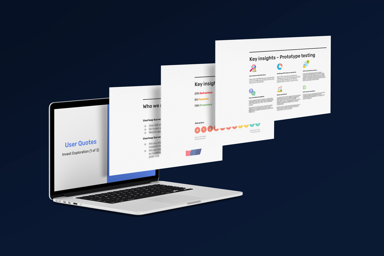
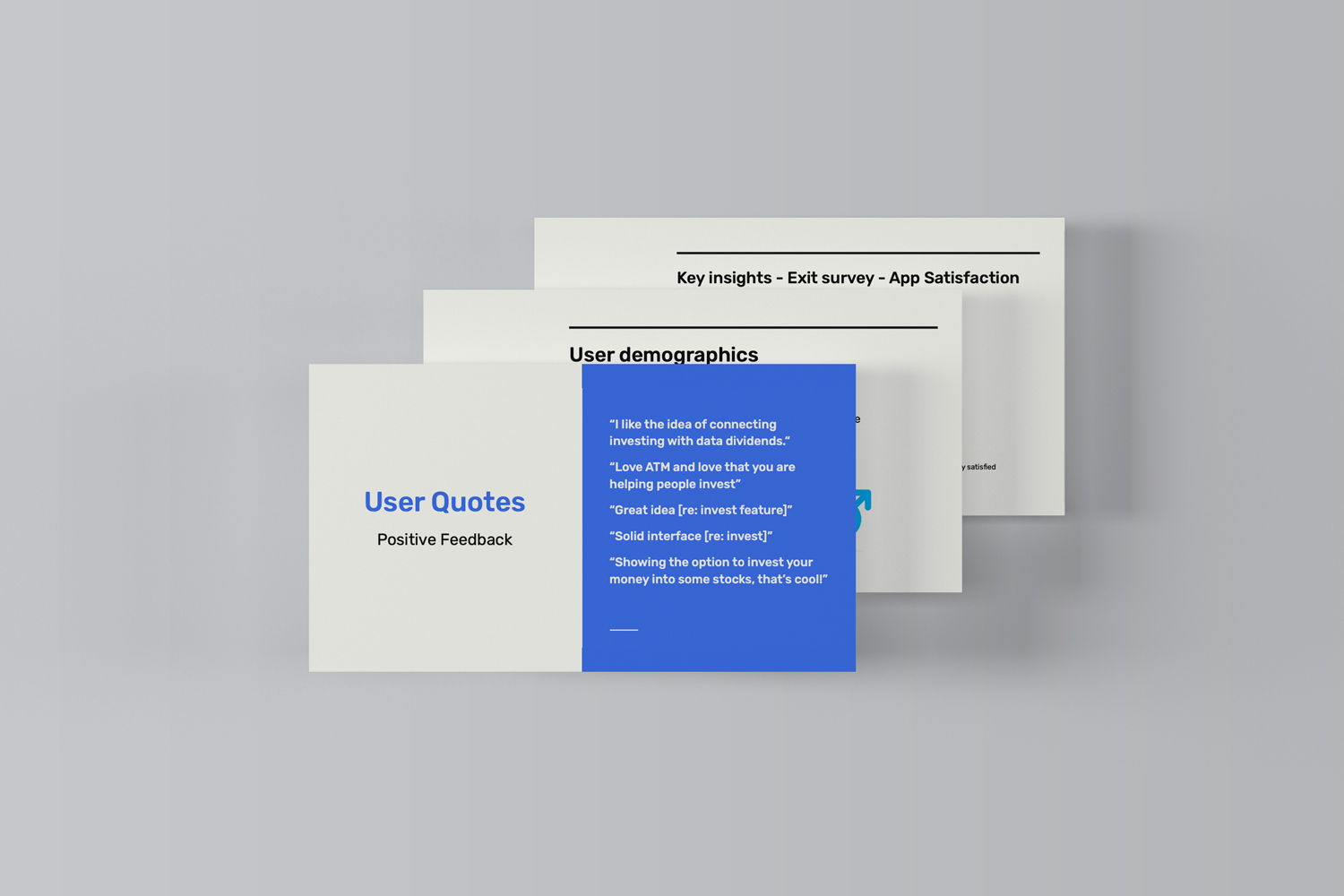
UX testing analysis & reporting (Google Slides) – Reviewed the user testing videos and Google form responses and put together a comprehensive report with action items / next steps before feature launch.
Programs Used


