ATM.com mobile app – Earn more rewards feature
Context
Why this project started? What was the initial hypothesis? Who were you designing for? What was the timeframe?
Background
The ATM.com mobile app was launched with minimal features in September 2020. The initial launch allowed users to 1) answer daily surveys, 2) earn a small amount of cash by opting to “match” with a daily brand (in the style of dating apps), and 3) earn additional cash back through brand message offers sent through the app’s messenger feature.
By June 2021, the app had started to gain traction and gain users significantly but the business wasn’t experiencing the revenue growth it expected based on the user growth.
Team structure
I worked as the lead on this project alongside two other team members of the design team, under the guidance of the design director, Ayo, and with the support of the visual designer, Terry.
I worked with the product manager, Soren, to define constraints and the minimum product requirements. My role included conducting the user + competitive research for this feature, pitching the idea to executive stakeholders, and exploring potential design solutions. I also worked cross-functionally with frontend and backend engineering to understand the level of effort that would be required for this new feature.
Timeframe
June 2021 – Feb 2022
Problem
What was the problem?
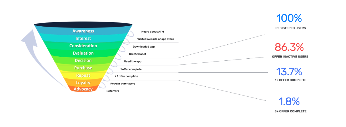
Looking at the Metabase analytics, I discovered that 86% of users had never completed an offer through the brand match messages. This was a huge source of concern as the brand offers were the primary source of revenue for ATM.
Approach
What was your process from initial problem to the final solution. What were the steps?
Discovery
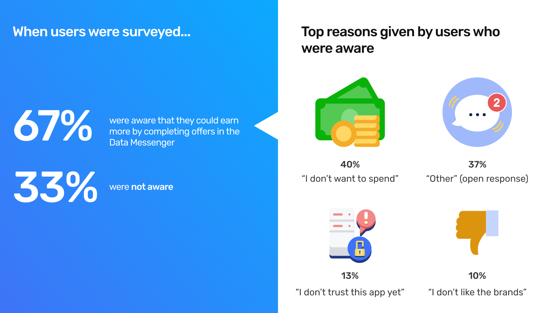
UX research – Sent an in-app contextual survey to see if users were aware of the offers in the brand messenger. Of the users surveyed, 1/3 responded that they didn’t know they could earn additional cash back through the messenger offers. Of the 2/3 aware, the most common reasons for not completing an offer were: not interested in spending money, not trusting the app, and not seeing brands they liked.
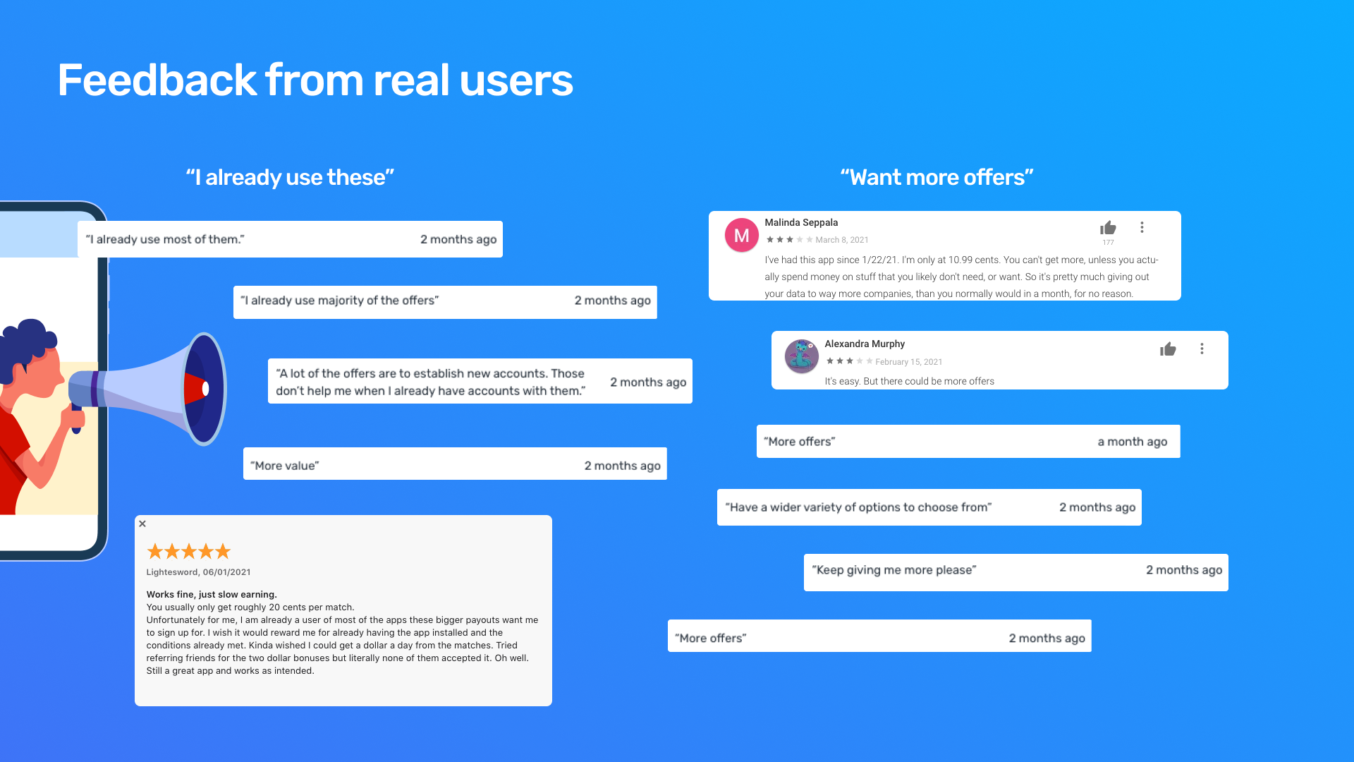
App reviews – Combed through reviews and saw that the majority of users who had left feedback regarding the brands / messenger offers fell into two camps: 1) they were already existing customers of the brand (and therefore ineligible for certain offers) or 2) they didn’t see any brands / offers they were interested in.
Users were not interested in the brands that were presented and frustrated by the lack of earning opportunities.
Define
How might we help users find brands/offers they are interested in?
Existing Feature Evaluation
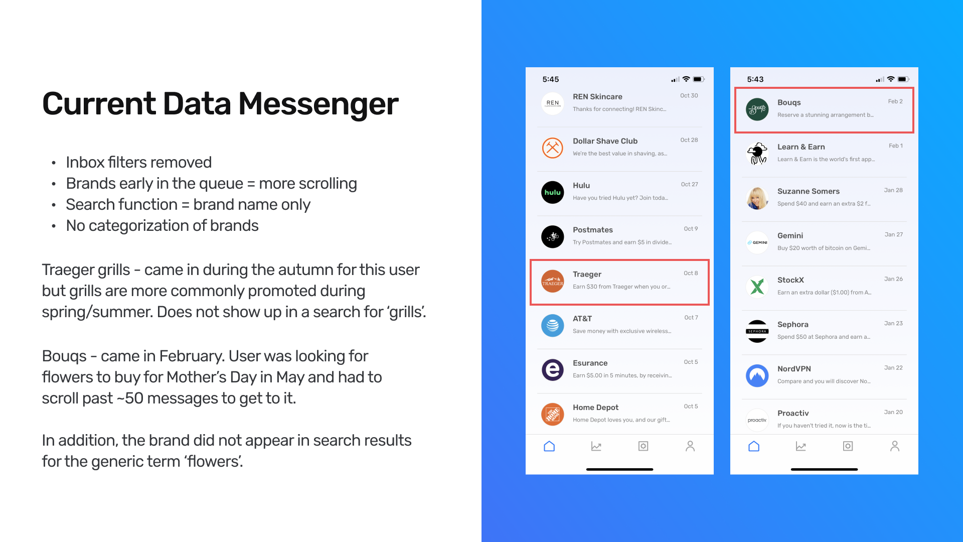
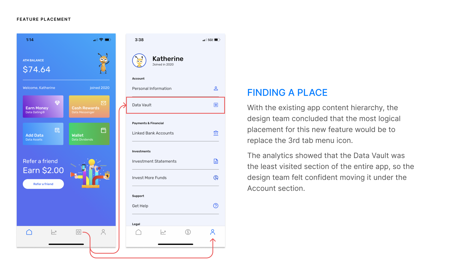
One major issue I discovered in the existing matching + message system was that older brand messages got pushed to the bottom of the message list, reducing discoverability and relevance.
In addition, the lack of a favoriting or saving mechanism in the message system meant that there was no easy way for users to go back and view messages they might be interested in outside of searching manually for the brand.
The search functionality in the messenger also was not optimized for generalized search terms.
Competitive Analysis
The design team decided to look at a number of apps and websites with a focus on:
- Cash back programs
- Retailers with diverse brands / merchandise
In analyzing these apps, we found a few commonalities such as:
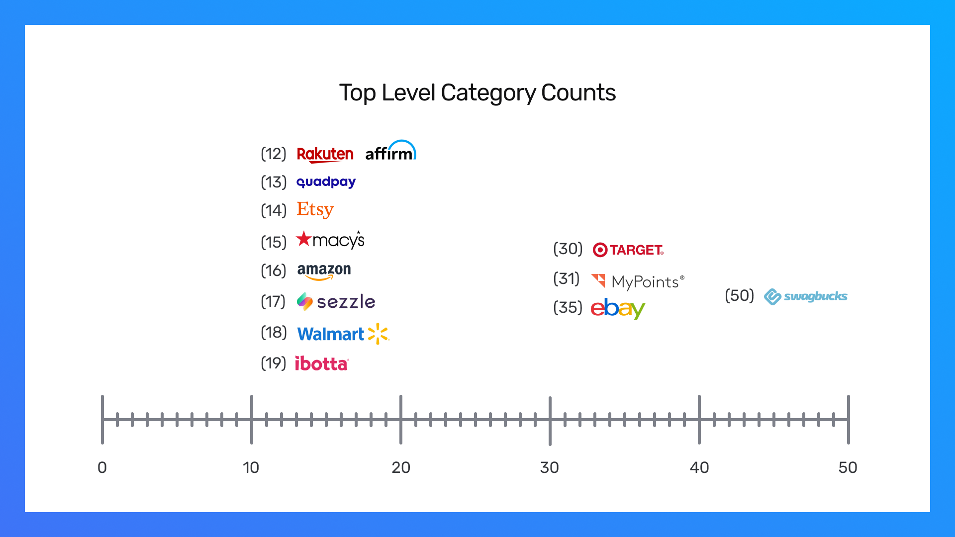
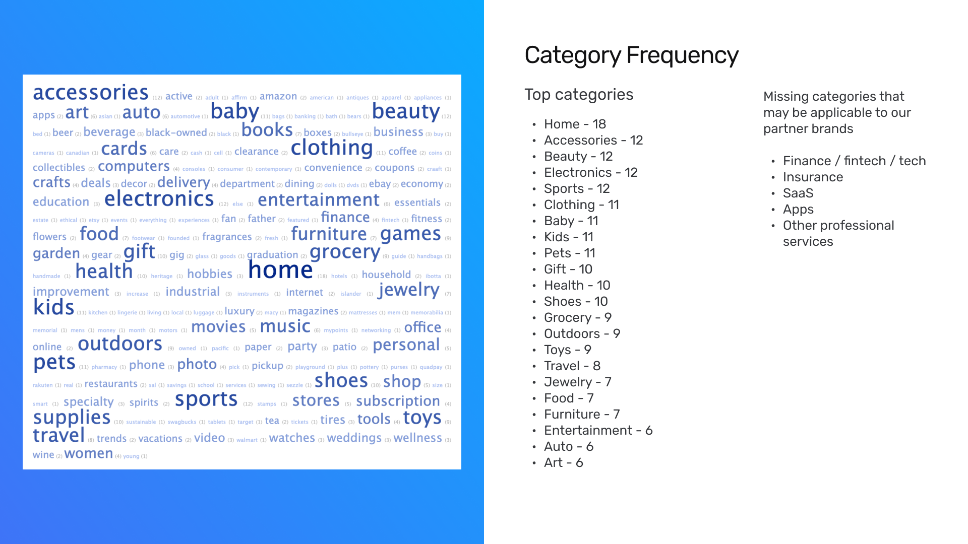
- Offerings being grouped by categories / subcategories
- Powerful and predictive search
- Seasonal content that corresponded with cyclical sales patterns
- “Smart content” driven by user behavior (e.g. showing new items that were similar to previous items from a user’s browsing history)
Output
Design artifacts. Your role and specific contributions in the project.
My role and individual contribution
- Led this initiative
- Competitive analysis
- Heuristic evaluation
- UX flows
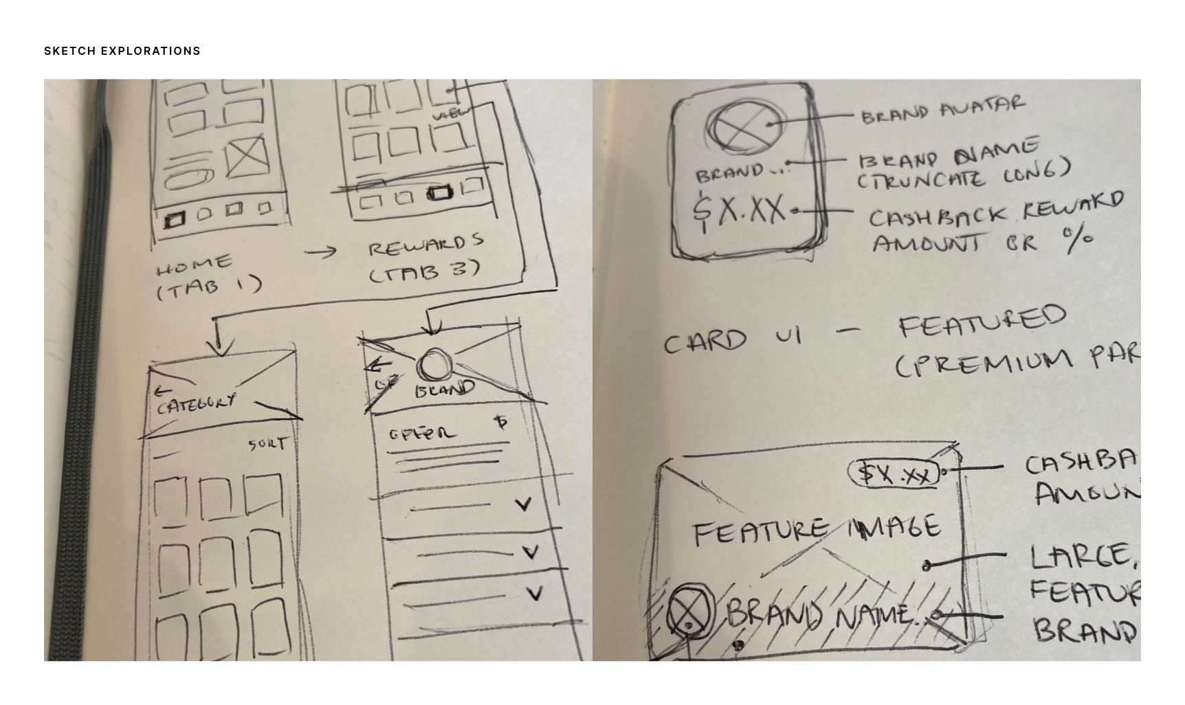
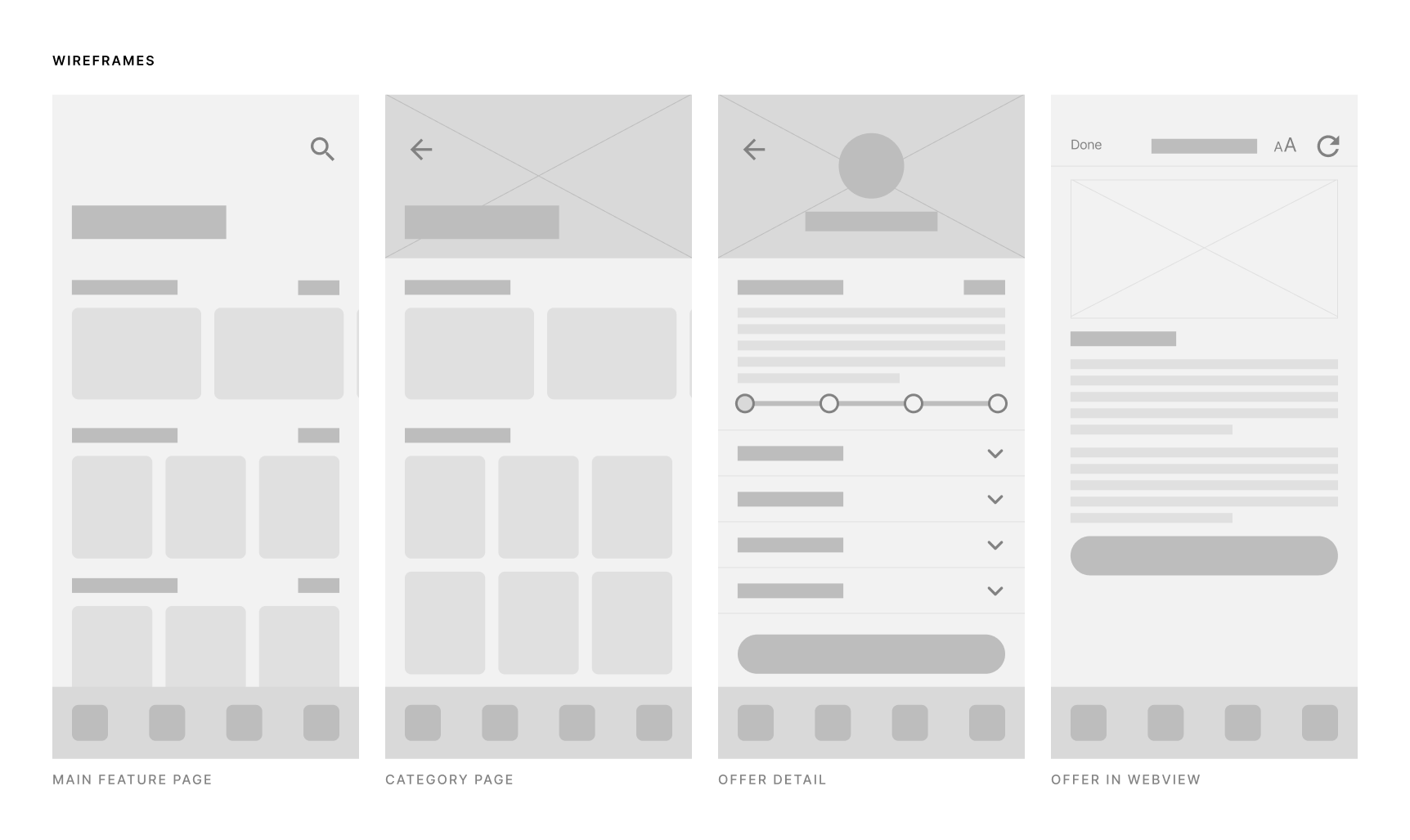
- Wireframes
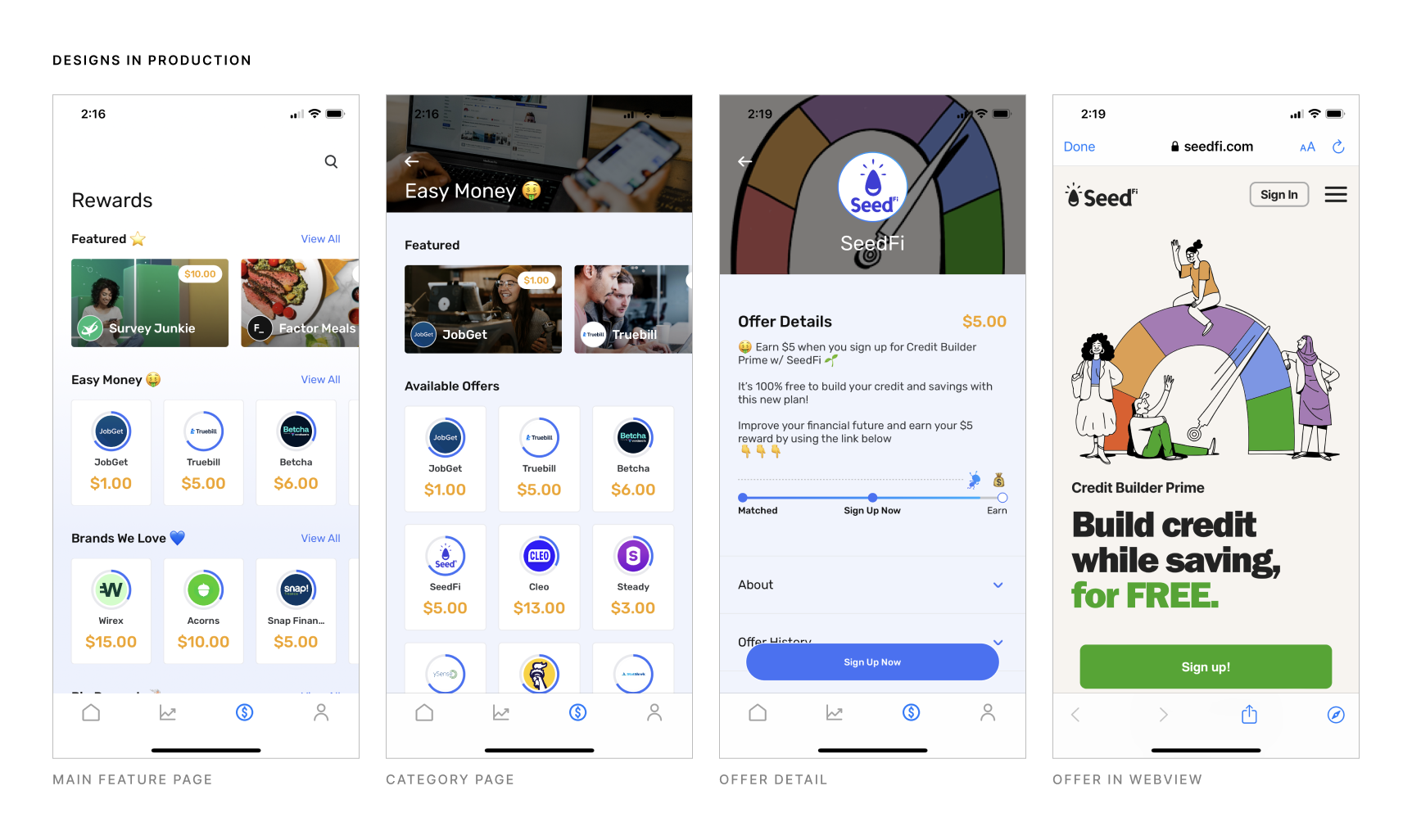
- Final designs
Outcome
Success metrics & outcomes. What was the impact on the business or the users?
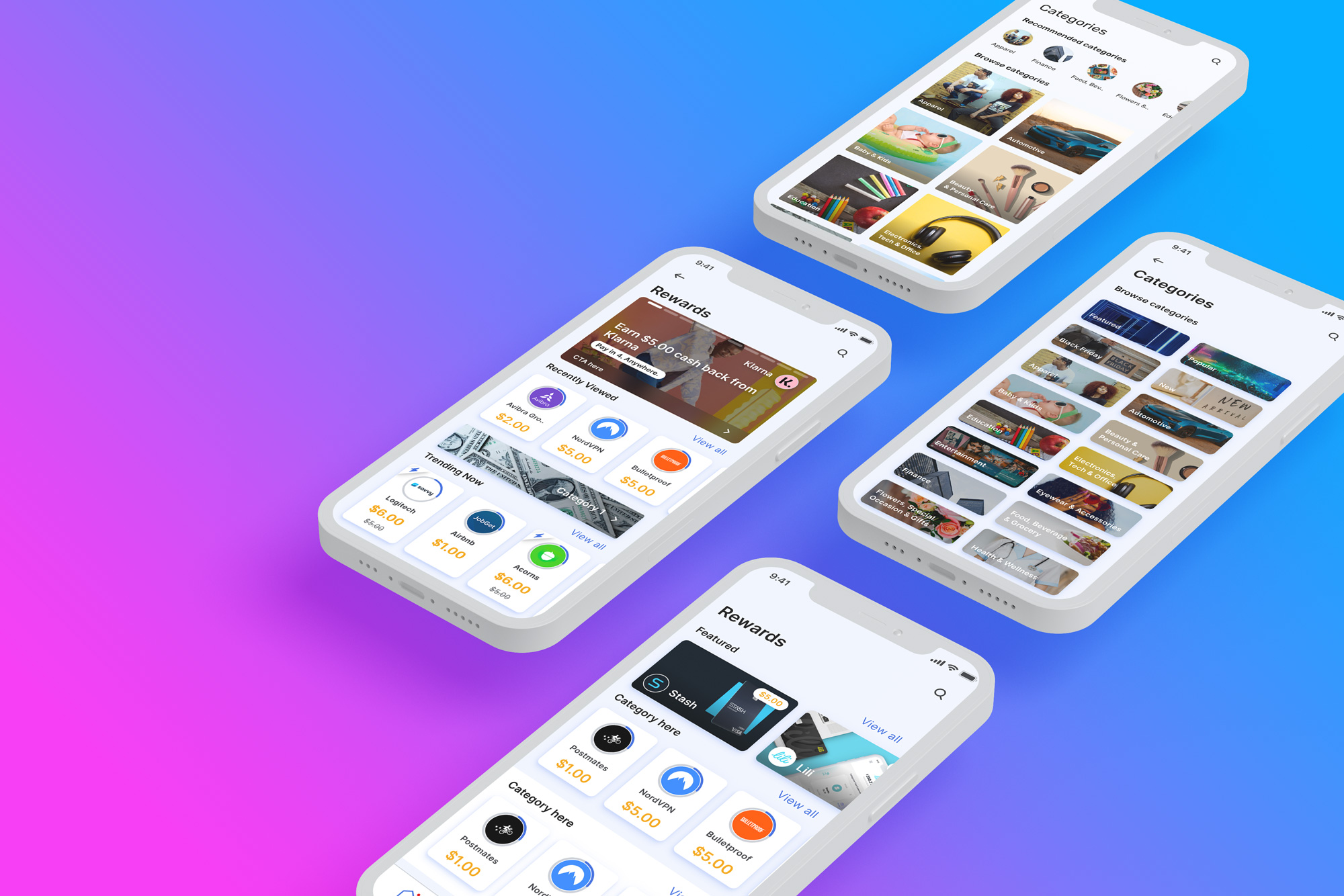
ATM launched a pared down version of the feature in Sept 2021. The v1.0 of the feature showed users their matches in the new card UI. One of the major improvements of the Earn More/Rewards feature over the Messenger was that old or expired offers were automatically hidden from users. This reduced user frustration and support tickets about not receiving credits to their accounts for completing old offers.
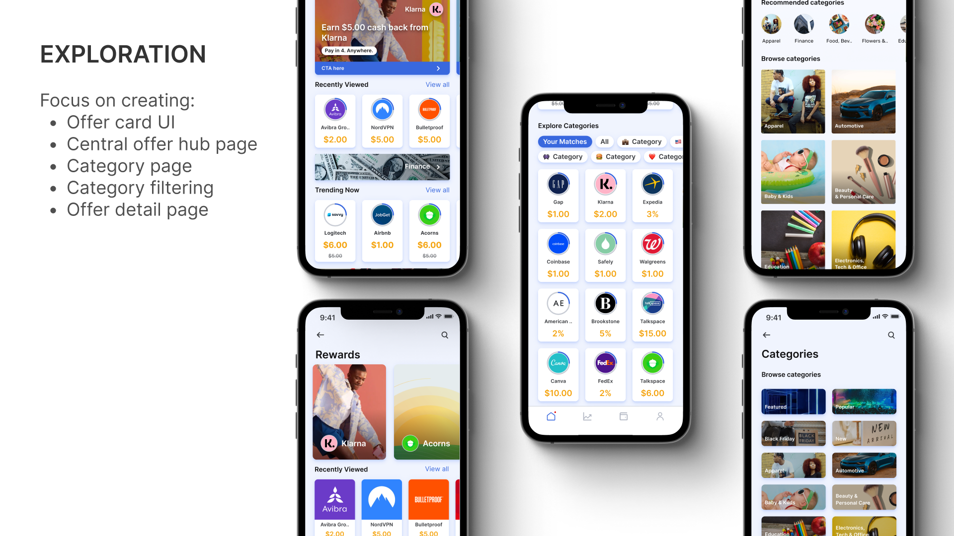
Over the next 3 months, the Earn More/Rewards feature was expanded to include category rows which helped users more easily identify and group offerings.
The business outcome of the feature launch was an increase in user active revenue percentage and increase to average revenue per user on day 0, day 1, day 7, and day 14.
This feature also created an additional revenue stream for ATM by allowing brands to purchase premium ad real estate within the product via the Featured Offers section.
